Trying to share one’s work without taking up a lot of time is essential in some cases.  I was thinking of a way to display a mini portfolio  in just a glimpse of an eye.  Below are two of the designs that came out of this thought process.
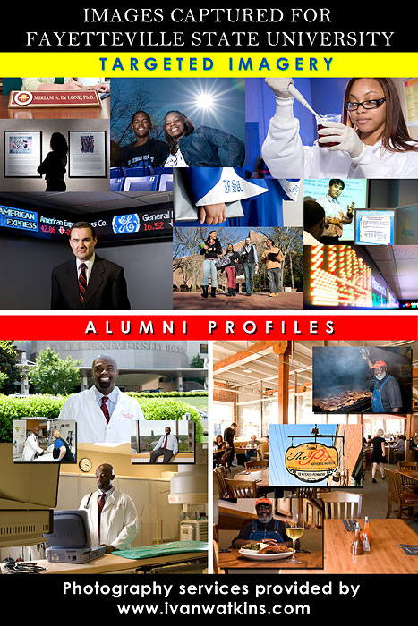
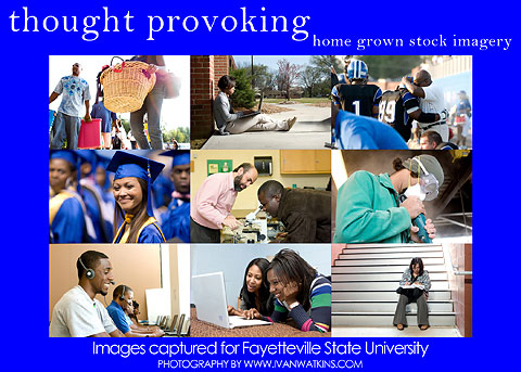
Trying to share one’s work without taking up a lot of time is essential in some cases.  I was thinking of a way to display a mini portfolio  in just a glimpse of an eye.  Below are two of the designs that came out of this thought process.


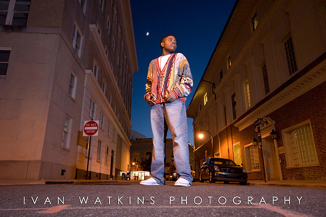
A few weeks ago The Haddock family approached me about a special project for their son Marquise. They mentioned that he is coming out with a CD and they required both photography and graphic design.  We set up a meeting to discuss some of the imagery and set dates to actually do all of the shooting. Once the images were captured I spent time creating the 4 pages and CD label using the text, image choices and font selections from the family. During our meeting I had the chance to hear some of the songs and I was really impressed.  This young man is extremely talented and all the songs were written, arranged and produced by him.   Below you will find some of the images from our shoot followed by the final designs.
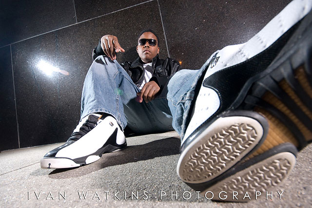

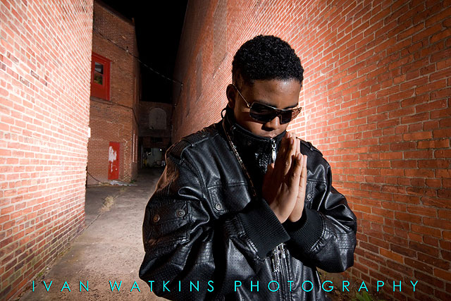
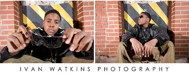
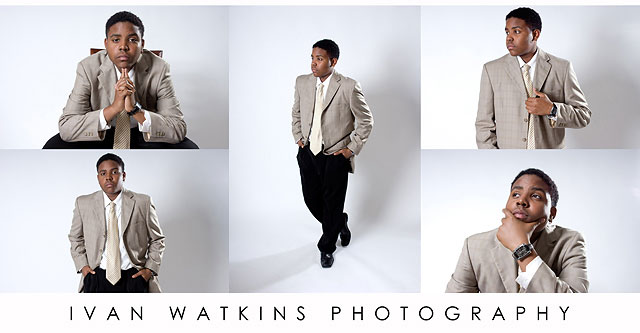
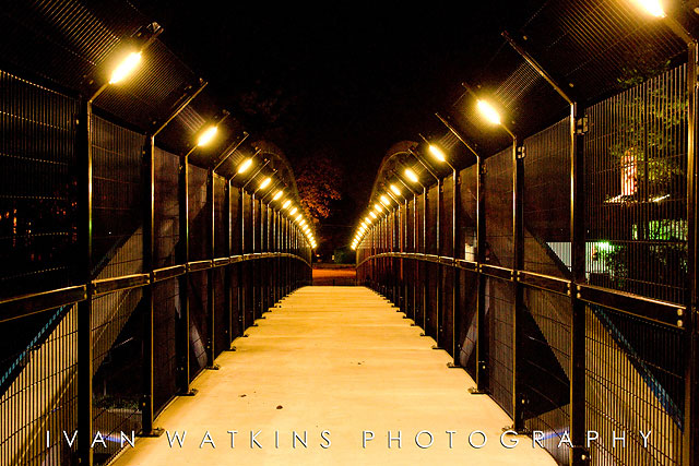
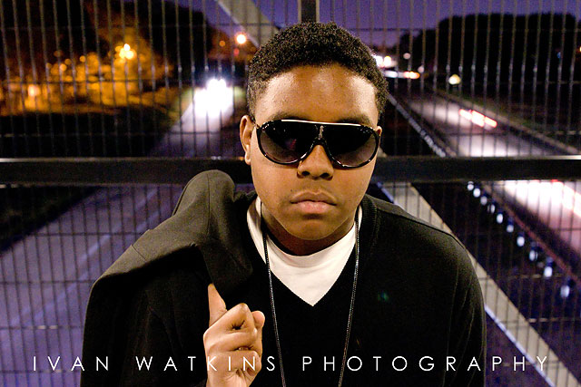
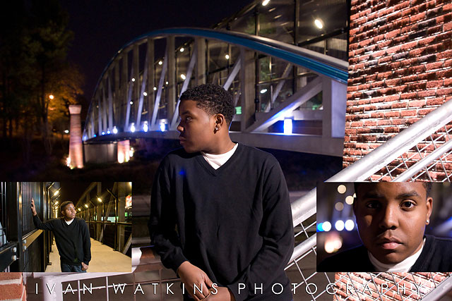
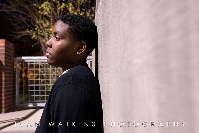
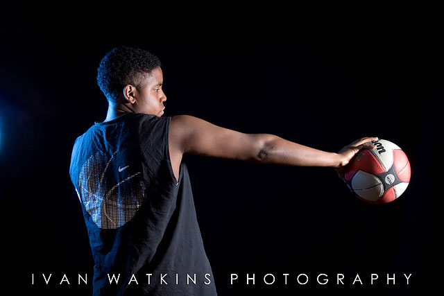
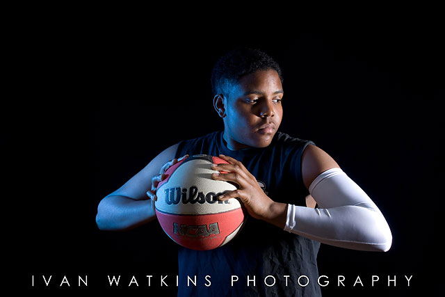
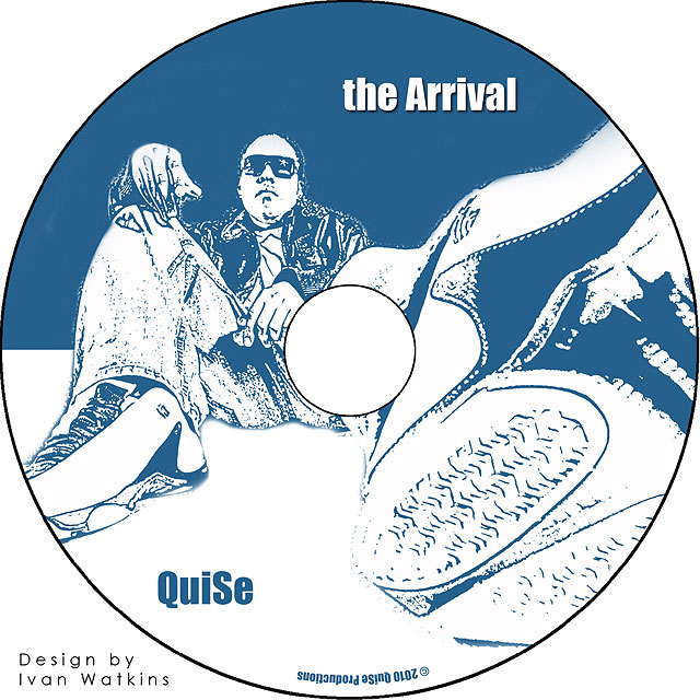
Here is the disk label that will be printed on each CD.
01 Intro
02 Arrival
03 Real Deal (featuring Duceswild)
04 Why I Try (remix featuring Duceswild)
05 Hold You Down
06 Make Her Feel
07 All Alone
08 Takes Too Long
09 Donald Duck Freestyle
10 Just Chillin
11 Already Know
12 Being Me
To order your copy contact Marquise Haddock at (919) 620 – 0688
The CD insert pages are featured below.

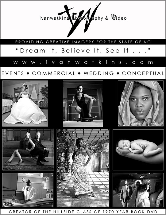
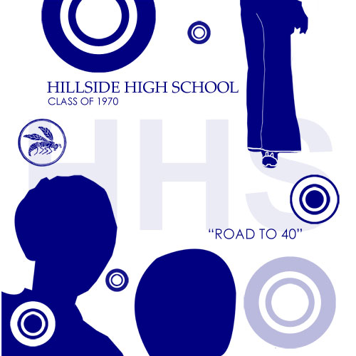
I’ve never bought an ad to do any advertising so this is a first for me. In my previous posting I shared that we just completed a project of converting a hard copy version of a year book to DVD format.  The 1970 reunion committee asked if I wanted to take out an advertisement in their booklet. After giving this some thought I decided that I would go with the 1/4 page but I didn’t want just plain text.  Below is the image that will be used in the booklet.
This had to be one of the most interesting projects that I’ve had in the past few months. Yes, I’ve photographed some exciting events but this project was cut from a different mold.  The HHS Class of 1970 committee approached me with a unique idea. They wanted to know if I could convert their hard copy year book into a DVD that other class members could purchase and watch.  The main thing I needed to hear was that we had permission from the original company from a copy right point of view. Each page was too large to be scanned and so I had to photograph each one.
After several meetings & proposals we settled on what the final product would be.  One request was related to the look and feel of the DVD Label. They said it should be “retro”.  With that being understood I came up with the afro/bell bottom design below and they approved it.
Below is the DVD menu that plays before the actual yearbook is shown.Â
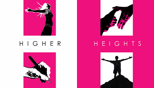
Not too long ago I was contacted by Wendy Reynolds who is  an editor with “Beauty Come Forth” magazine. She explained that she was in need of a new business card for her “Higher Heights” brand.
As we spoke on the phone we brainstormed on several concepts and after a little while I was able to catch the vision of what she does.  Her requirements were that the card should give a person the feeling of being inspired, give the sense of the ability to achieve, contain the primary colors pink and white and last but not least be completely different from any other card that another person might have in their wallet.   Â
As I awoke from a nap I saw the design as clear as day in my head. The vision that was revealed to me is now realized in the two sided card below. I thank God for the ability He has given me to start tapping into a more creative side of life.
Â
